Slidedocs

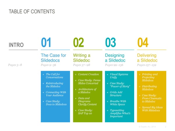
TABLE OF CONTENTS INTRO 01 02 03 04 The Case for Writing a Designing Delivering Slidedocs Slidedoc a Slidedoc a Slidedoc Pages 3–8 Pages 9–36 Pages 37–98 Pages 99–136 Pages 137–159 + The Call for + Content Creation + Visual Systems + Printing and Conversations Unify Projecting + Case Study: Dense Slidedocs + Reintroducing Slides Converted + Case Study: the Slidedoc “Power of Story” + Distributing + Architecture of Slidedocs + Connecting With a Slidedoc + Grids Add Your Audience Structure + Case Study: + Data and From Cinematic + Case Study: Diagrams + Breathe With to Slidedoc Docs to Slidedocs Clarify Content White Space + Spread Big Ideas + Case Study: + Typesetting With Slidedocs SAP Top 10 Amplifies What’s Important © Duarte, Inc. 2014 2
COMMUNICATION HAS CHANGED Business is moving faster than ever. Employees are constantly asked to do a In the process, we’ve all but little bit more, a little bit faster. killed long-form business communications. This obsession with pace has caused us to weed out inefficiency on nearly every Today, content not boiled down to its level, especially when it comes to essence is a time-waster. Long, detailed, communication. multipage documents of prose take too Internet and mobile long to read between e-mails and meetings. So, we ignore them until our communications have schedules allow a long block of time for reconditioned people to prefer consuming dense information—if that time consuming information in ever comes. small chunks. Short blog posts get the most traffic. You can barely fit a couple of sentences in a LINK: PICTORIAL LEARNING tweet. And text messages usually only take up a line or two. LINK: MULTIMEDIA LEARNING LINK: SCIENTIFIC STUDY © Duarte, Inc. 2014 3
SHORTER COMMUNICATION IS THE NEW NORM As a result, shorter, tighter, visual The best way to spread visual communication is the go-to method for ideas is through slides. The getting everybody on the same page quickly. People learn concepts better slide format makes it easy for when they see pictures combined with people to capture great ideas prose. Therefore, visual media like and share them. presentations are used more readily. Since first starting Duarte, Inc. in 1988, At Duarte, we’d often see slides we had I’ve watched this trend toward visualized reused in hundreds of different communicating visually intensify. In our presentations within the organization. early years, we cleaned up slides from Great slides spread. people who were desperate not so much to give a verbal presentation, but to These short, tight, atomic bites of content express their ideas visually and spread have become the default way of visually them throughout their organization. communicating ideas. © Duarte, Inc. 2014 4
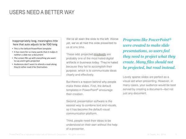
USERS NEED A BETTER WAY We’ve all seen the slide to the left. Worse Programs like PowerPoint® yet, we’ve all had this slide presented to were created to make slide us at one time. presentations, so users feel These odd, projected misdeeds are they need to project what they probably one of the most hated digital create. Many files should not artifacts in business today. They’re hated because they fail to accomplish their be projected, but read instead. purpose, which is to communicate ideas clearly and effectively. Lovely sparse slides are perfect as a visual aid when presenting. However, in But there’s a reason behind why people make these slides. First, the default many cases, your audience would be best templates in PowerPoint® encourage served by creating a document—but not their creation. just any document. Second, presentation software is the easiest way to combine text and visuals, so it has become the default visual communication platform. Third, people need their ideas to be understood on their own without the help of a presenter. ® PowerPoint is a registered trademark of Microsoft Corporation. All rights reserved. © Duarte, Inc. 2014 5
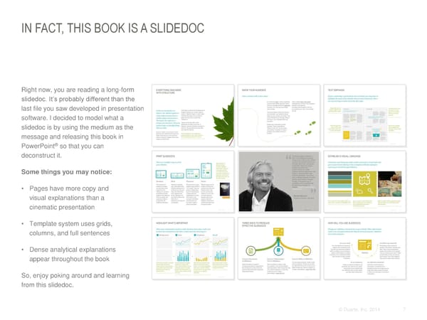
IN FACT, THIS BOOK IS A SLIDEDOC Right now, you are reading a long-form slidedoc. It’s probably different than the last file you saw developed in presentation software. I decided to model what a slidedoc is by using the medium as the message and releasing this book in PowerPoint® so that you can deconstruct it. Some things you may notice: • Pages have more copy and visual explanations than a cinematic presentation • Template system uses grids, columns, and full sentences • Dense analytical explanations appear throughout the book So, enjoy poking around and learning from this slidedoc. © Duarte, Inc. 2014 7
SLIDEDOCS™: A NEW MEDIUM It’s time for a new medium— A slidedoc is a document created using Slidedocs work because: a medium that retains presentation software, where visuals and words unite to illustrate one clear point Uniform format of a slide encourages presentation software’s per page. clear, succinct articulation and ability to seamlessly visualization of concepts on one page. The result is a medium that can be read integrate graphics and and digested more quickly than either a Editable nature allows it to be a living words—and quickly travel document or a presentation. document that is collaborative and can can evolve over time. throughout organizations. Slidedocs are meant to be printed or distributed and read on screen without the Overarching view allows you to see the accompaniment of a presenter. whole, instead of only the parts. By working in outline or slide sorter mode, My books so far have advised people on you can see the entire message and how to create sparse, highly visual structure in addition to individual pages. presentations. So, it might come as a surprise to hear me support another use Spreadability allows the smartest pages to spread throughout an for slide software. We’ve been creating slidedocs for the past 25 years because organization. Great slidedocs are reused again and again. they help quickly spread our clients’ ideas around their organizations. Slidedocs™ is a trademark of Duarte Press LLC. All rights reserved. © Duarte, Inc. 2014 6
YOU NEED A SLIDEDOC IF… This slidedoc will teach you how to use presentation software to create visual documents that will travel throughout your organization without much effort on your part after the initial authoring process. You should create a slidedoc if: • Your information could be consumed ahead of time and the meeting time Understand the Create persuasive • You have detailed information to could be used for consensus building visual display of story content to convey, but you won’t be around to information so the connect to an explain it Hopefully, you’ve already read my audience can see audience who previous books as a foundation to help what you’re responds with • You have detailed subject matter that create strong content and compelling saying. action. is conducive to being conveyed with cinematic visuals for your presentations. visuals and prose This new book covers key insights for • People consume your information creating a slidedoc. Your slidedocs will be better when it is broken into smaller, more impactful if you’ve read Resonate more visual chunks and Slide:ology. • Your sales team needs modular collateral and tools that are flexible enough to get the right material to the Create persuasive visual right customers documents for the way people consume information today. © Duarte, Inc. 2014 8


The Case for Slidedocs +The Call for Conversations +Reintroducing the Slidedoc +Connecting With Your Audience +Case Study: Slides to Slidedocs 01 ©© DDuuaarrttee,, IInncc.. 22001144 99
+ The Call for Conversations 01 ©© DDuuaarrttee,, IInncc.. 22001144 1010
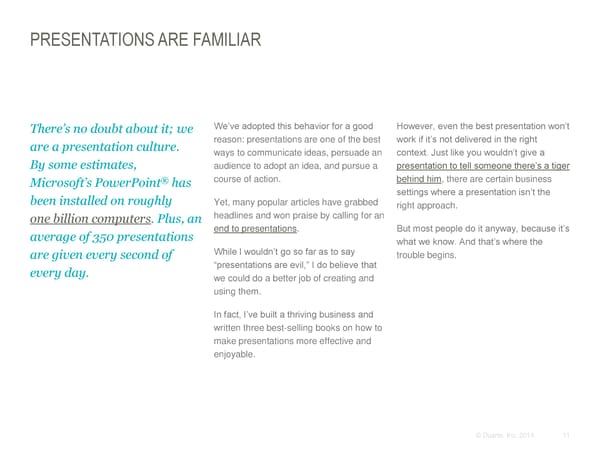
PRESENTATIONS ARE FAMILIAR We’ve adopted this behavior for a good However, even the best presentation won’t There’s no doubt about it; we reason: presentations are one of the best work if it’s not delivered in the right are a presentation culture. ways to communicate ideas, persuade an context. Just like you wouldn’t give a By some estimates, audience to adopt an idea, and pursue a presentation to tell someone there’s a tiger ® course of action. behind him, there are certain business Microsoft’s PowerPoint has been installed on roughly settings where a presentation isn’t the Yet, many popular articles have grabbed right approach. one billion computers. Plus, an headlines and won praise by calling for an average of 350 presentations end to presentations. But most people do it anyway, because it’s what we know. And that’s where the are given every second of While I wouldn’t go so far as to say trouble begins. every day. “presentations are evil,” I do believe that we could do a better job of creating and using them. In fact, I’ve built a thriving business and written three best-selling books on how to make presentations more effective and enjoyable. © Duarte, Inc. 2014 11
THE RIGHT TOOL FOR THE RIGHT JOB Presentations play a vital role in many settings, but they need additional support through slidedocs to continue the momentum. Presentation Conversation Webinar Spread Ideas Meeting Video E-mail Event © Duarte, Inc. 2014 12
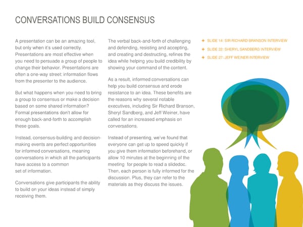
CONVERSATIONS BUILD CONSENSUS A presentation can be an amazing tool, The verbal back-and-forth of challenging SLIDE 14: SIR RICHARD BRANSON INTERVIEW but only when it’s used correctly. and defending, resisting and accepting, SLIDE 22: SHERYL SANDBERG INTERVIEW Presentations are most effective when and creating and destructing, refines the SLIDE 27: JEFF WEINER INTERVIEW you need to persuade a group of people to idea while helping you build credibility by change their behavior. Presentations are showing your command of the content. often a one-way street: information flows from the presenter to the audience. As a result, informed conversations can help you build consensus and erode But what happens when you need to bring resistance to an idea. These benefits are a group to consensus or make a decision the reasons why several notable based on some shared information? executives, including Sir Richard Branson, Formal presentations don’t allow for Sheryl Sandberg, and Jeff Weiner, have enough back-and-forth to accomplish called for an increased emphasis on these goals. conversations. Instead, consensus-building and decision- Instead of presenting, we’ve found that making events are perfect opportunities everyone can get up to speed quickly if for informed conversations, meaning you give them information beforehand, or conversations in which all the participants allow 10 minutes at the beginning of the have access to a common meeting for people to read a slidedoc. set of information. Then, each person is fully informed for the discussion. Plus, they can refer to the Conversations give participants the ability materials as they discuss the issues. to build on your ideas instead of simply receiving them. © Duarte, Inc. 2014 13
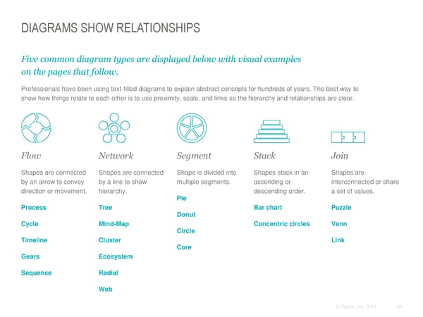
DIAGRAMS SHOW RELATIONSHIPS Five common diagram types are displayed below with visual examples on the pages that follow. Professionals have been using text-filled diagrams to explain abstract concepts for hundreds of years. The best way to show how things relate to each other is to use proximity, scale, and links so the hierarchy and relationships are clear. Flow Network Segment Stack Join Shapes are connected Shapes are connected Shape is divided into Shapes stack in an Shapes are by an arrow to convey by a line to show multiple segments. ascending or interconnected or share direction or movement. hierarchy. descending order. a set of values. Pie Process Tree Bar chart Puzzle Donut Cycle Mind-Map Concentric circles Venn Circle Timeline Cluster Link Core Gears Ecosystem Sequence Radial Web © Duarte, Inc. 2014 86
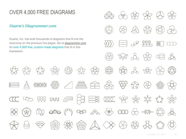
OVER 4,000 FREE DIAGRAMS Duarte’s Diagrammer.com Duarte, Inc. has built thousands of diagrams that fit into the taxonomy on the previous five pages. Go to diagrammer.com for over 4,000 free, custom-made diagrams that fit in this framework. © Duarte, Inc. 2014 92
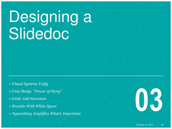
Designing a Slidedoc +Visual Systems Unify +Case Study: “Power of Story” +Grids Add Structure +Breathe With White Space 03 +Typesetting Amplifies What’s Important ©© DDuuaarrttee,, IInncc.. 22001144 9999
+ Visual Systems Unify 03 ©© DDuuaarrttee,, IInncc.. 22001144 100100
SLIDEDOCS ENABLE VISUAL CONVERSATIONS Visuals clarify ideas. When visuals are used to explain concepts, readers understand them better. A visual brief is better than a text brief, because if people can see what you’re saying, they will understand you more clearly. ® ® Tools like PowerPoint , Keynote , and Google Slides® easily incorporate graphics and text around a single idea. Create a slidedoc that acts as a resource for your organization, with established layout or design guidelines that a person can work within or manipulate. This slidedoc template should allow space for dense text and leave room for a visual that can amplify the meaning of the prose. Visualizing information shows you have command over the subject matter and that Ultimately, you’re communicating so you get people you care enough about it to make it on board with your idea. When there’s agreement, easily understood. there’s action. ® ® Keynote is a registered trademark of Apple Inc. Google Slides is a registered trademark of Google. © Duarte, Inc. 2014 101 All rights reserved.
ESTABLISH A VISUAL LANGUAGE Consistent visual language helps readers associate a visual style with you or your brand. Baking it into a template will help employees express your brand through slidedocs. Use a consistent color palette. Select 3–5 Buy or create a robust illustration Create or curate a library of photography colors, plus a neutral and highlight color. library that’s relevant to your industry that looks like it was shot by the same and stylistically consistent. Avoid cheesy photographer. clip art. © Duarte, Inc. 2014 102
THIS SLIDEDOC USES THIS VISUAL LANGUAGE TITLES USE ARIAL NARROW ALL CAPS 22 PT. FONT SIZE Subtitles use Georgia italics 16 pt. font size Main body copy use Arial 12 pt. font size Captions to graphics and photos use Georgia italics 12 pt. font size Typesetting and color are a strong design Constrain your color palette and always All the custom illustrations use the element in this slidedoc. include at least two neutral colors. In this same style and overlap to create a case, there are two shades of gray. sense of depth and richer colors. © Duarte, Inc. 2014 103
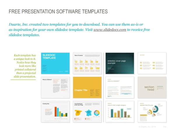
FREE PRESENTATION SOFTWARE TEMPLATES Duarte, Inc. created two templates for you to download. You can use them as-is or as inspiration for your own slidedoc template. Visit www.slidedocs.com to receive free slidedoc templates. Each template has a unique look to it. Notice how they look more like printed collateral than a projected slide presentation. © Duarte, Inc. 2014 104
MAKE SLIDEDOCS EASY TO IDENTIFY As an organization, you may want to develop two distinctly different templates for presentations and slidedocs. It will be easy for your employees to identify whether their content is to be read or presented. Each organization should make it self-evident which templates should be used for presentations (slides to be projected), and which ones should be used for slidedocs (pages to be read). This practice will make it easier for employees to quickly identify which tool to use for the job. The following pages offer different ways you could distinguish a presentation from a slidedoc. You could use one or a combination of the distinguishing identifiers to help your organization communicate effectively. © Duarte, Inc. 2014 105
MAKE SLIDEDOCS DISTINCT Below are choices that help differentiate between slidedocs and presentations. You can choose one or multiple. Aspect ratio Orientation Animation 4:3 portrait static landscape animates 16:9 The 4:3 aspect ratio works well for Another possible way to differentiate Since animations can only be viewed slidedocs to read on devices and prints between the slidedocs and slides is to in slideshow mode, using them in well on letter size paper. You might use portrait mode for slidedocs, which presentations makes perfect sense. choose this option for a slidedoc and allows it to mimic a traditional Eliminating animations and builds in a keep a 16:9 version of a template for document, and use landscape mode slidedoc is a good rule of thumb since presentations. More projectors are for projected presentations. This is not they are usually printed and need to be using the wider aspect ratio which a hard rule, just an optional way to clear of all artifacts from animations make it great for corporate help distinguish the differences. that obscures any content. presentations. © Duarte, Inc. 2014 106
MAKE SLIDEDOCS DISTINCT Below are choices that help differentiate between slidedocs and presentations. You can choose one or multiple. Word density Background color Document-like features One Concept Table of Light Contents BIG IDEA Dark Since slidedocs are to be read, the Often slidedocs are printed or read Several features of a slidedoc are layouts should have a much longer onscreen. It’s best if the background inspired by books and dense word count and denser graphical is a white or a light color to make it documents. Layouts can have up to content as a default. easy on the eye to read and also 175 words and other document Whereas presentations are print-friendly. features like a table of contents, conceptual and used to amplify the If you want to make a distinction page numbers, and section heads. spoken word through simple, using color, you could project your Presentations are more visual than emotive concepts, a slide may slides on a dark background with words and usually have only have only one word. light text. This creates a more cinematic emotive visuals. formal presentation setting. © Duarte, Inc. 2014 107
+ Breathe With White Space 03 ©© DDuuaarrttee,, IInncc.. 22001144 121121
ADDING WHITE SPACE Established in 1867, Harper’s Bazaar was America’s first fashion magazine. The late 1800s was a no-nonsense era when resources like paper were scarce and highly valued, and printing was expensive. You can see how much information was packed into the pages of a single issue. When readers finished an issue, they didn’t throw it away; it was reused for insulating walls and kindling for their fireplace. The dense design was a direct reflection of societal values of the time. Source: HarpersBazaar.com © Duarte, Inc. 2014 122
YOUR CONTENT NEEDS ROOM TO BREATHE In 1934, the magazine discovered young His work revolutionized both fashion and Russian designer Alexey Brodovitch and magazine design. Adding white space and brought him on as Art Director. Brodovitch’s dramatic cropped images helped Harper’s work has been described as “bold and Bazaar surpass Vogue as the top arresting,” featuring “cropped fashion magazine. photographs, typography, and design” on “pages that bled beautifully.” The following two pages provide examples of how Brodovitch created designs that Brodovitch's signature use of white space breathe with white space. and the cinematic quality created through image cropping brought gracefulness to “A good picture must be a completely individual expression the layouts. His design compelled Truman which intrigues the viewer and forces him to think.” Capote to write, “What Dom Pérignon was – Alexey Brodovitch, to champagne...so [Brodovitch] has been to... photographic design and editorial Art Director * layout.” * Source: http://en.wikipedia.org/wiki/Harper's_Bazaar and http://en.wikipedia.org/wiki/Alexey_Brodovitch © Duarte, Inc. 2014 123
© Duarte, Inc. 2014 124
© Duarte, Inc. 2014 125
USA, 1898 - 1971
"If you know yourself, you are doomed."
- Alexey Brodovitch
Brodovitch in New York,
c. 1960
Photograph by Henri Cartier-Bresson
martini advertisement
1926

Athelia
Catalogue Cover
1929
Madelios Catalogue Sports
Catalogue Cover
1929
* More would follow. In the mid 1930's Paul Rand, influenced by avant-garde european art, started his own design practice.
At the Philadelphia college of Art Brodovitch teached by using examples of european graphic design, questioning his students about the placing of the elements and the decisions made by the designers. He once said "we learn by making mistakes. We must be critical of ourselves and have the courage to start all over again after each failure. Only then do we really absorb, really start to know."* He placed himself on the same level as his students, treating them as equals. He often brought real design assignments to the classroom, asking his students to think along.
* Brodovitch, 'Brodovitch on Brodovitch', 45.
Brodovitch reviewing
page layouts. He saw photographs in sequence as if they were frames in a film.
Photograph by Richard Avedon.
1959
Brodovitch in his office at Harper's Bazaar. Photograph by Maurice Tabard.
ca. 1950
"I saw a fresh, new conception of layout technique that struck me like a revelation: pages that bled beautifully, cropped photographs, typography and design that were bold and arresting. Within ten minutes i had asked Brodovitch to have cocktails with me, and that evening i signed him to a provisional contract as art director."
- carmel snow*
* Carmel Snow and Mary Louise Aswell,'The world of Carmel Snow', NY, McGraw-Hill, 1962,90.
Harper's Bazaar, September 1956
Photograph by Richard Avedon
Harper's Bazaar,
April 1940
Design by A.M. Cassandre
Besides his work at Bazaar, his freelance work grew throughout the forties. In 1949 Frank Zachary felt the need to create an american publication focused on art and design, like there had been several in europe. When looking for an art director they thought of Paul Rand and Brodovitch. Rand appeared to be too much of an artist and not enough of an art director, so Brodovitch became director of Portfolio.
The Ultra Violets
Article in Harper's Bazaar, Photographs by
Richard Avedon.
published in the last issue directed by Brodovitch
August 1958
The Ultra Violets
Article in Harper's Bazaar, Photographs by
Richard Avedon.
published in the last issue directed by Brodovitch
August 1958
LUXURY BRANDS USE WHITE SPACE The more breathing room you give to a design or product, the more luxurious it’s perceived to be. Many brands have embraced the concept of white space. When creating a slidedoc, surround key points with white space (also called “open space” or “clear space”) to draw the eye toward the most important elements on the page. Examples of advertisements using white space © Duarte, Inc. 2014 126
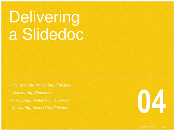
Delivering a Slidedoc +Printing and Projecting Slidedocs +Distributing Slidedocs +Case Study: Notes View How-To +Spread Big Ideas With Slidedocs 04 ©© DDuuaarrttee,, IInncc.. 22001144 137137
+ Distributing Slidedocs 04 ©© DDuuaarrttee,, IInncc.. 22001144 143143
DISTRIBUTE SLIDEDOCS ONLINE Link to your slidedoc on SlideShare to get the word out. Embed E-mail SlideShare presentations can SlideShare can track who has be embedded into HTML seen the file, connect them to pages. Anywhere a YouTube your website, and collect video can go, a SlideShare contact information which slidedoc file can go. generates leads. Share Analytics Instead of e-mailing a large file SlideShare is a great tool for that clogs inboxes, send a link distributing slidedocs. Upload to the SlideShare file online. your presentation, and it translates into a format that can be broadly and publicly distributed online. © Duarte, Inc. 2014 144
USE SLIDEDOCS FOR WEBINARS A few years ago, I conducted a survey to see how many people Have meeting attendees read one page and discuss that topic. attended presentations remotely versus in person. The results When attendees read the slidedoc and then discuss it, it engages showed that 85% of presentations were remote. It’s harder to them more often. Each time you advance to a new slide, if make a sincere connection with an audience when you’re not in attendees are multitasking, they’ll have to minimize e-mail (or the same room. whatever they’re doing) to read the slide so they can continue to be a participant. But again, don’t read or present the slide to Managers spend most of their workday in meetings. Many them; it’s faster if they read it and then discuss it. managers consider almost half of those meetings a waste of time. So when meetings are already feeling like a waste, make You can also use slidedocs as a guide and context for all the yours more productive by using a slidedoc. topics you want to talk over. Putting the topics you’ll be discussing in a slidedoc moves the meeting along. It also helps In a remote meeting situation, you’re attendees gauge how much you’ve covered as the meeting competing with many attendee distractions, progresses. the primary one being their e-mail. If your If you’re using telepresence or other emerging video systems, sending slidedocs ahead of time will ensure that your material isn’t more interesting than their communication is failsafe (you never know what might go wrong inbox, they won’t be 100% present. with technology). © Duarte, Inc. 2014 145
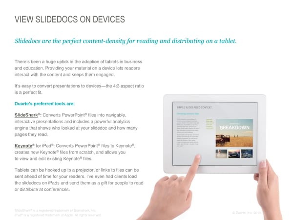
VIEW SLIDEDOCS ON DEVICES Slidedocs are the perfect content-density for reading and distributing on a tablet. There’s been a huge uptick in the adoption of tablets in business and education. Providing your material on a device lets readers interact with the content and keeps them engaged. It’s easy to convert presentations to devices—the 4:3 aspect ratio is a perfect fit. Duarte’s preferred tools are: SlideShark®: Converts PowerPoint® files into navigable, interactive presentations and includes a powerful analytics engine that shows who looked at your slidedoc and how many pages they read. ® ® ® ® Keynote for iPad : Converts PowerPoint files to Keynote , creates new Keynote® files from scratch, and allows you to view and edit existing Keynote® files. Tablets can be hooked up to a projector, or links to files can be sent ahead of time for your readers. I’ve even had clients load the slidedocs on iPads and send them as a gift for people to read or distribute at conferences. ® SlideShark is a registered trademark of Brainshark, Inc. ©© DDuuaarrttee,, IInncc.. 22001144 146 ® iPad is a registered trademark of Apple. All rights reserved.
THE DANGER OF CIRCULATING SPARSE PRESENTATIONS Beautiful, minimalistic, cinematic slides don’t have enough information in them to stand on their own as a document when distributed. In fact, when slides travel around with only an image and a handful of words, the readers have to fill in far too many blanks to understand their meaning. As you embrace simplifying slides, this is an unexpected negative side effect. Slides are a backdrop for the spoken word, not rich in content themselves. Their vagueness leaves room for a recipient to make up what was said, develop inaccurate conclusions, and misconstrue the meaning. As presentations are passed along without the presenter, If the graphic above was used important information is lost. Data is dropped that helps make alone on a slide, how would your case. you know what was said about it? For example, are The same is true when distributing slides on platforms like these people contributing to or SlideShare. The slides need to be self-explanatory and clear, pulling from this “system”? because metaphorical concepts are open to interpretation. The Vague metaphors can be following case study shows how to create a slidedoc in notes misunderstood if they are view of your cinematic slides so readers know what you said to shared without explanation. your slides. © Duarte, Inc. 2014 147
CONTACT US If you want to contact Duarte: If you want to contact Nancy: www.duarte.com Twitter: Facebook: LinkedIn: 650-625-8200 @duarte Duarte, Inc. Duarte, Inc. info@duarte.com Twitter: @nancyduarte LinkedIn: Nancy Duarte Blog RSS: SlideShare: YouTube: Duarte Blog Feed Duarte, Inc. Duarte, Inc. © Duarte, Inc. 2014 160
© D©u aDrutaer,t eI,n Icn.c .2 2001144 161
© D©u aDrutaer,t eI,n Icn.c .2 2001144 162

ENGAGING WITH DUARTE We’d love to help! Consulting Design Publishing Events Multimedia Duarte’s writers are We design cinematic Duarte can transform We craft compelling, Duarte creates skilled in persuasive presentations that awe your content memorable keynote and interactive storytelling practices. and inspire, robust (presentation, book, breakout session presentations, visual Whether your content template systems that sales tools, slidedoc, presentations that essays, videos, and needs a complete help foster better technical pub, and motivate audiences. We animated demos that rework or you’re starting companywide collateral) into a can also provide overall further engage with a blank page, our communication, and platform-agnostic, event theme and audiences. We can writers can create your pre-existing content that visually rich, easily design support. also extend the life of a entire story from start just needs that extra navigable, dynamic presentation by making to finish. something. document to use on it web- and/or tablets or mobile YouTube-ready. devices. © Duarte, Inc. 2014 163
Amanda Working with you was a blast! Thank for wrangling and writing chunks of this puppy. This book is real because of a herd of Duartians Diandra Ashley, Chris, This book is Dave, Doug, beautiful Emily, Janice, because you Kelly, Michelle, make everything Patti, & Paula beautiful. Special Ric Thanks Your support over Aisling, Denise, the years and on Tyler & Ivan this slidedoc has The book wouldn’t have astounded me. happened without your http://www.ricbret.com rocking design skills and tenacity. Dan Denise, Your template Janet, Kyle & wizardry has made Stephanie this slidedoc and Your case studies and the free templates template designs are Thank you for generously magical to use. beautiful and central And it wouldn’t be a valuable book to this book. donating the slidedoc.com without a cute pic of my granddogs domain to this cause. Bear and Necessity. © Duarte, Inc. 2014 164
About the author: Nancy Duarte is a communication expert. Her firm, Duarte, Inc., is the global leader behind some of the most influential visual messages in business and culture. She is the author of three award- winning books. Resonate: Present Visual Stories That Transform Audiences, identifies the hidden story structures inherent in great communication, and it spent more than 300 days on Amazon’s top 100 business book bestsellers list. Slide:ology: The Art and Science of Creating Great Presentations teaches readers to think visually and has been translated into eight languages. Plus, the HBR Guide to Persuasive Presentations, a field guide with quick ways to up your presentation game and more effectively present data-rich information. ©© DDuuaarrttee,, IInncc.. 22001144 165165